
Thursday, 30 April 2015
Ancillary task - Magazine review
Hey! Here is my magazine review for my short film. Its a page from a magazine called FilmFan, enjoy.
Wednesday, 29 April 2015
Ancillary Task - Film Poster
Below is finished film poster for my upcoming short film titled 'Humans Can Lick Too':


Why did I go with this idea?
While I was pondering over ideas for my film poster during the shoot for my upcoming short film, I had a sudden flash of a poster in my head; and this is whats above. I wanted something clear, simple, intriguing and something that stood out. I think this poster ticks all these boxes: the title of the film written in blood clearly tells you that the film will be an extremely creepy horror film, the design is simple yet effective, and finally I think that the title of the film would certainly make you stop and ask questions - I mean what a weird name for a film right? But if you take a few minutes out of your busy lives to watch this film that the poster is advertising, the riddle will all become clear.
How was this poster produced?
I began by creating poster ideas within Microsoft Word, shocking I know, and when it came to my best idea, I took to the one and only photo editing suites: Abobe Photoshop. I began editing the title of the film that would go on the poster. I used my hands to wipe fake blood allover my bathroom's tiled walls, for the sake of the film. However, I took a few photos and decided to also use it on the poster. I started by putting the original photo into photoshop and then I painted around all the blood using a white paint brush tool.
I spent quite a lot of time zoomed in the image, slowly painting unwanted parts of the image with the white paint brush. Eventually I ended up with the image above. After doing this, I exported it as a PNG file and then I moved on to producing the other key parts of the film poster: the credits, film festival nominations/awards and the social media links. This did not take too long and in about one hour I had the finished product which you can see at the top.
What kind of feedback did I get about this poster?
After I began sharing this poster with my fellow peers and teachers, I received lots of positive feedback. People said that they admired the simplicity of the poster, but said that it caught their attention and they really liked the design. Others went on to give the reaction that I had hoped for; this reaction being that they were really intrigued by the poster because of the title of the film. They said if they had seen it on the high street or at the cinema entrance they would stop and ask themselves the question: what could this film be about? I have made sure that the poster does not give too much anyway. As always with feedback, I received some ideas on how to film poster could be improved. A small minority of people who I showed this poster too said that they would have liked to have seen more on the poster to make it more interesting. One person in particular said that a transparent and faded face of the main character behind the title would have made the poster more engaging. However, I did not make these changes because I wanted to keep my film poster really simple and I really wanted the blood written title to stand out and contrast with the white background.
What do you think about my poster? Any thoughts will be much appreciated, so just pop a comment down below on this post. Thanks for reading, have an excellent day.
Tuesday, 28 April 2015
Magazine cover
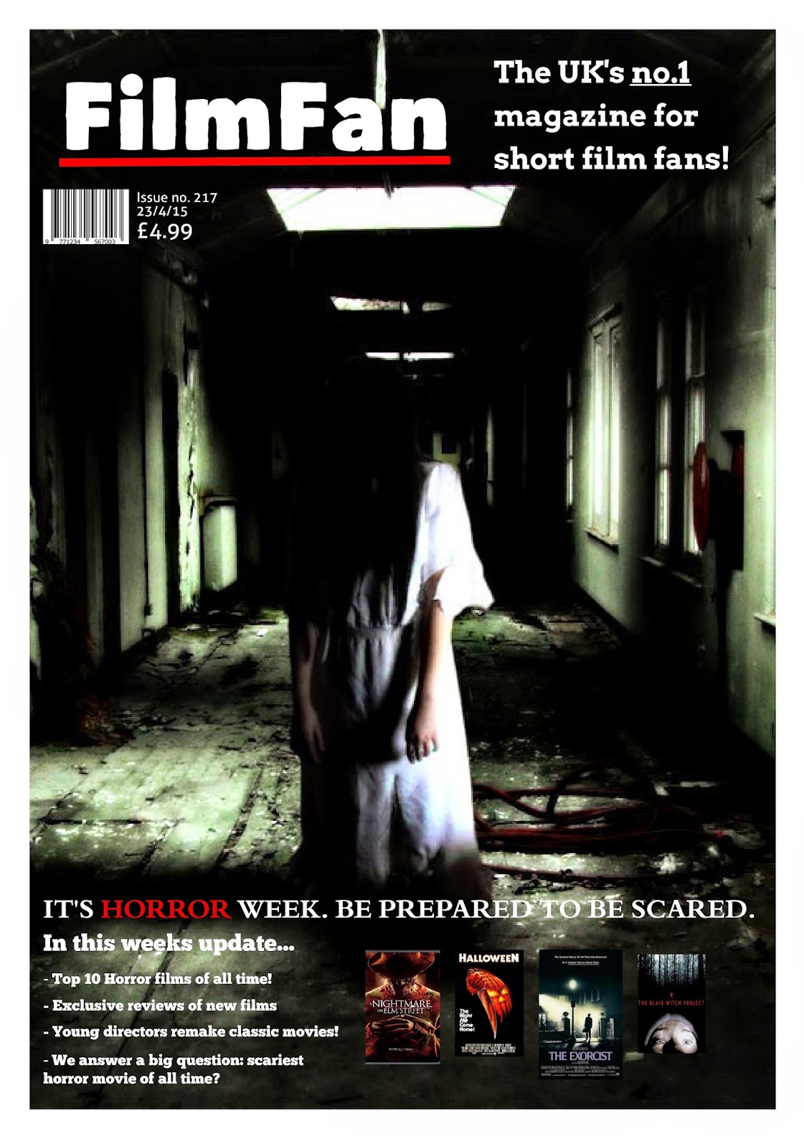
Hey guys! It's been a while since I last posted, but I've been really busy cracking on with my media coursework evaluation, which will all be on here by the end of this week. Last week, I finished my other ancillary task, the magazine review, which I'll post and talk about about separately, but for this post I just wanted to show you the front cover I made, as I had half an hour to spare. Here is the cover for the 'horror week' edition of FilmFan, the magazine I created which will feature a review about my short film.
Subscribe to:
Comments (Atom)